Case Study
Redesigning the handy homepage

hi inc (Formerly Tink Labs) is a global lifestyle & travel technology platform which provides hotel booking services, travel content, smart products and data intelligence.
handy smartphone, hi Inc’s flagship product, is a complimentary guest amenity offering free connectivity, travel content, services, and in-destination offers. I work closely with the B2C team to develop and iterate handy’s features and to improve users’ travel experiences.
Our goal is to redesign handy's homepage so users get easily navigate the page and find what they want to see based on interests and needs.
Role
UX/UI Designer
Involvement
Competitive Analysis
Information Architecture
User Flow
UI Design
Date
Jan-Apr 2019
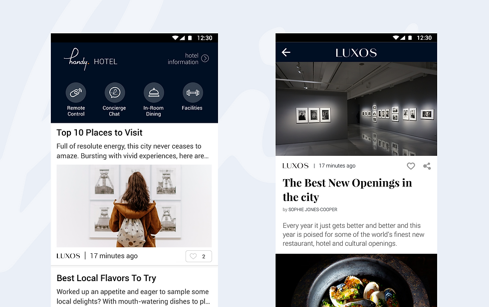
Old homepage design
THE PROBLEM
CONTENT HAS A LACK OF FLEXBILITY
Previously, the homepage was designed in a "newsfeed" concept with infinite scrolling. The content was displayed on handy in article format, without providing the flexibility for users to choose what they want to see based on their preferences.
01 Highlight all integrated features
02 Users can also easily navigate the home page to find what they need as a traveler
03 The redesign will need to be scalable as it will cover our major markets such as Hong Kong, Singapore, London, and Japan.
Our goals for the redesign:
DESIGN APPROACH
Our team looked into similar travel apps such as Klook, Trip.com, TripAdvisor, Dianping, Airbnb to see how travel content is displayed and to understand how users can engage with the content easily.
We discovered most of these apps use modular design to display their content as the components can be reused and rearranged. Modular design can provide us with more flexibility in content display and grouping.
Although modular design is not a new design approach, handy has been around since 2012 and we felt it is time to do a redesign. Displaying our content using modular design can potentially solve a lot of our pain points.

References from left to right: Trip.com, Airbnb, Klook
THE SOLUTION
CONTENT REGROUP & MODULAR DESIGN
Using a modular design layout for the new homepage, we are able to include a lot more content with ease. We created a modular design layout with the focus of the three main categories: Eat, Shop, Do as we believe these are the top needs of travelers. Instead of just presenting all of the content in an infinite scroll, users now have more control over what they want to see.
At the top, we also included a "Toolbar" to highlight all of handy's unique features such as Free Calls, Wi-Fi Hotspot, maps, etc. We also believe that these features are users' essentials when they are traveling and exploring a new area. It is placed at the top for easy access.


Final design of the homepage
This version of the homepage has been released to hotels in Hong Kong, Singapore and London. Our next steps include implementing the new design systems to the homepage, adding more content modules, and combining the City Guide with the homepage.