Case Study
Enhancing trading experience with Swap and Bridge
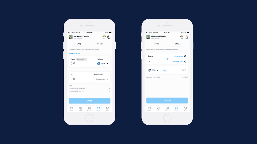
The Crypto.com DeFi Wallet is a non-custodial wallet that securely stores all your crypto assets. The app offers two main trading features: Swap and Bridge.
In response to user and market demand, we quickly implemented the Bridge feature alongside Swap in 2021.
To further enhance the user experience, we seek to gather user feedback on the priority of Swap and Bridge and redesign these features accordingly.
Our goal is to improve the functionality of both features based on user insights.
Role
Product Designer
Involvement
Research
Information Architecture
User Flow
Prototyping
Timeline
Apr - Jun 2022
THE PROBLEM
UNINTUITIVE & CONFUSING DESIGN
The original design of Bridge was not user-friendly, as it was not immediately clear to users how to navigate the flow. The Bridge feature was also hidden alongside Swap, which made it confusing for users to understand and access.
Furthermore, the original design lacked sufficient information for users to learn more about both features, and users had no control over which feature they wanted to use.
Due to technical limitations and chain availability at the time, the original design triggered Swap and Bridge based on the selected token and chain, leading to additional confusion for users.

Too many buttons, can be confusing to users
Bridge feature is hidden within Swap
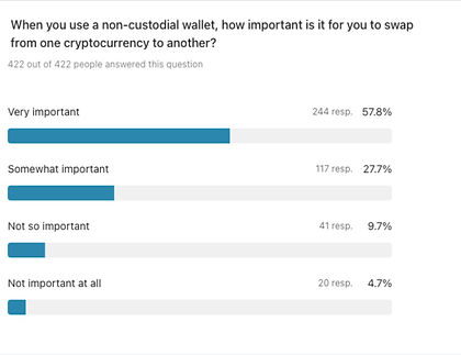
RESEARCH
A/B TEST & SURVEY
An A/B test was conducted between our current design and a prototype to 5 participants within our crypto community.
Some insights on the existing design include:
01 Too many components require users' attention, making it complicated to understand
02 Unintuitive to have the selection of the chain embedded inside the token selection page

KEY INSIGHTS
WHAT'S THE HIERACHY OF THE TWO FEATURES?
01
Swap and Bridge are equally important to users, and it shouldn't be hidden
02
It's essential to make Swap and Bridge the primary focus, without any additional distractions.
03
Seeing the details (fees) of the transactions ahead will enhance the overall experience
FINAL SOLUTIONS
We decided to create separate tabs for Swap and Bridge in our final design. Based on user feedback, we also made changes to display a preview of network and service fees earlier in the process, right after the selection of tokens and chains. This was done to make the information easily accessible to users and avoid any confusion later on in the flow.
